
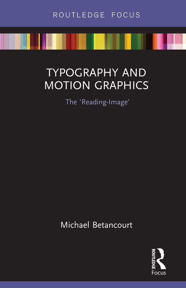
In his latest book, Michael Betancourt explores the nature and role of typography in motion graphics as a way to consider its distinction from static design, using the concept of the ‘reading-image’ to model the ways that motion typography dramatizes the process of reading and audience recognition of language on-screen. Using both classic and contemporary title sequences—including The Man With the Golden Arm (1955), Alien (1979), Flubber (1998), Six Feet Under (2001), The Number 23 (2007) and Scott Pilgrim vs. The World (2010)—Betancourt develops an argument about what distinguishes motion graphics from graphic design. Moving beyond title sequences, Betancourt also analyzes moving or kinetic typography in logo designs, commercials, film trailers, and information graphics, offering a striking theoretical model for understanding typography in media.
Payez facilement par carte, Klarna, Apple Pay ou Google Pay. Pas satisfait ? Vous avez toujours une garantie de remboursement de 14 jours. En savoir plus dans nos conditions. Si vous avez des questions, envoyez-nous un e-mail à hello@memmo.org.
Memmo facilite tes études, où que tu sois dans le monde. On rassemble tes manuels de cours et des outils d'étude intelligents au même endroit : résumés, quiz, podcasts et flashcards. Et il y a Ted, ton compagnon d'étude qui répond à toutes tes questions. Plus de 50 000 étudiants étudient déjà ici – conçu pour t'aider à apprendre plus vite et à moins stresser.