
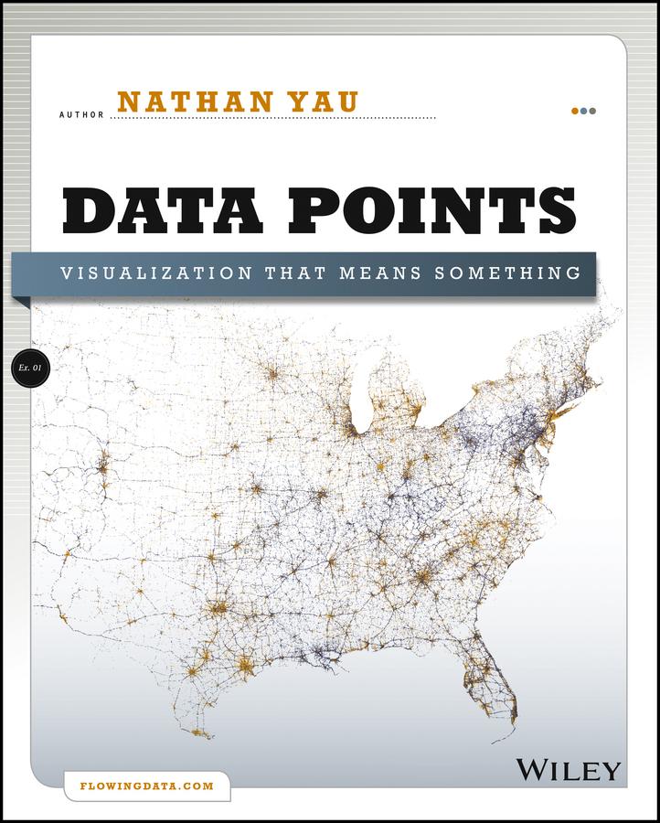
A fresh look at visualization from the author of Visualize This
Whether it's statistical charts, geographic maps, or the snappy graphical statistics you see on your favorite news sites, the art of data graphics or visualization is fast becoming a movement of its own. In Data Points: Visualization That Means Something, author Nathan Yau presents an intriguing complement to his bestseller Visualize This, this time focusing on the graphics side of data analysis. Using examples from art, design, business, statistics, cartography, and online media, he explores both standard-and not so standard-concepts and ideas about illustrating data.
- Shares intriguing ideas from Nathan Yau, author of Visualize This and creator of flowingdata.com, with over 66,000 subscribers
- Focuses on visualization, data graphics that help viewers see trends and patterns they might not otherwise see in a table
- Includes examples from the author's own illustrations, as well as from professionals in statistics, art, design, business, computer science, cartography, and more
- Examines standard rules across all visualization applications, then explores when and where you can break those rules
Create visualizations that register at all levels, with Data Points: Visualization That Means Something.
Maksa helposti kortilla, Klarnalla, Apple Paylla tai Google Paylla. Etkö ole tyytyväinen? Sinulla on aina 14 päivän palautusoikeus. Lue lisää ehdoistamme. Jos sinulla on kysyttävää, lähetä meille sähköpostia osoitteeseen hello@memmo.org.
Memmo tekee opiskelusta helpompaa – missä päin maailmaa ikinä oletkin. Meillä yhdistät kurssikirjat ja fiksut opiskelutyökalut yhteen paikkaan: tiivistelmät, visat, podcastit ja muistikortit. Ja sitten Ted, opiskelukaverisi, joka vastaa kaikkeen, mitä ikinä mietitkin. Yli 50 000 opiskelijaa opiskelee jo täällä – rakennettu auttamaan sinua oppimaan nopeammin ja stressaamaan vähemmän.