
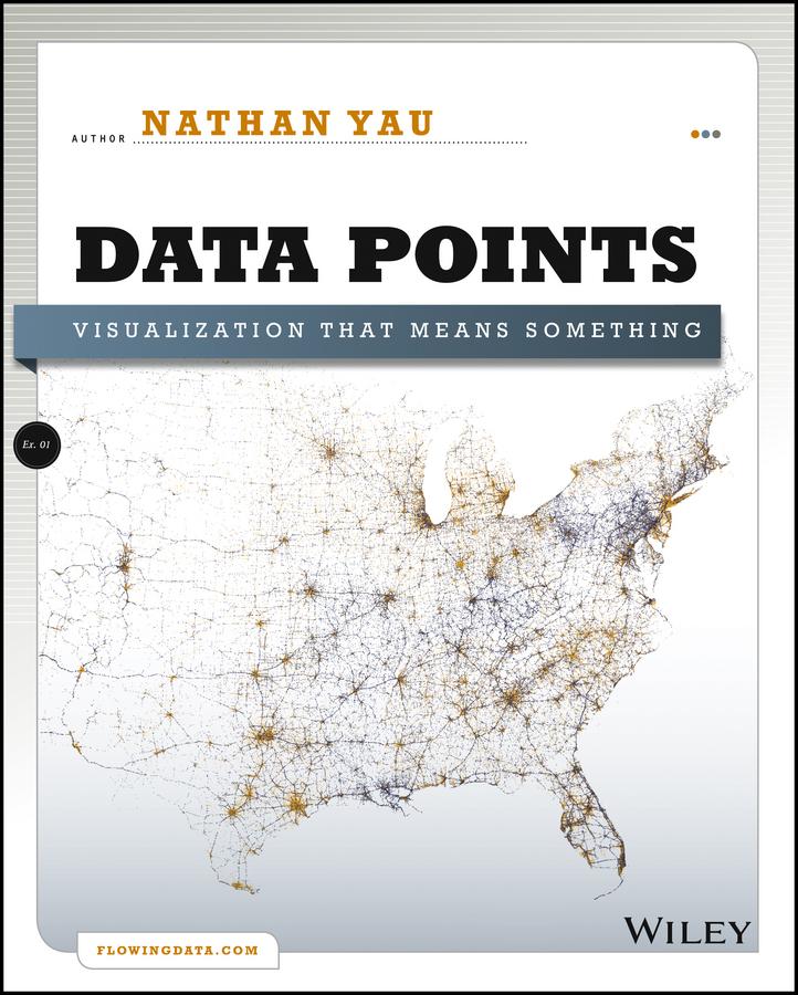
A fresh look at visualization from the author of Visualize This
Whether it's statistical charts, geographic maps, or the snappy graphical statistics you see on your favorite news sites, the art of data graphics or visualization is fast becoming a movement of its own. In Data Points: Visualization That Means Something, author Nathan Yau presents an intriguing complement to his bestseller Visualize This, this time focusing on the graphics side of data analysis. Using examples from art, design, business, statistics, cartography, and online media, he explores both standard-and not so standard-concepts and ideas about illustrating data.
- Shares intriguing ideas from Nathan Yau, author of Visualize This and creator of flowingdata.com, with over 66,000 subscribers
- Focuses on visualization, data graphics that help viewers see trends and patterns they might not otherwise see in a table
- Includes examples from the author's own illustrations, as well as from professionals in statistics, art, design, business, computer science, cartography, and more
- Examines standard rules across all visualization applications, then explores when and where you can break those rules
Create visualizations that register at all levels, with Data Points: Visualization That Means Something.
Betala smidigt med kort, Klarna, Apple Pay eller Google Pay. Är du inte nöjd har du alltid 14 dagars ångerrätt. Läs mer i våra villkor. Har du några frågor, mejla oss på hello@memmo.org.
Memmo gör det enklare att plugga – var du än är i världen. Hos oss samlar du kursböcker och smarta studieverktyg på ett och samma ställe: sammanfattningar, quiz, poddar och flashcards. Och så Ted, din studiekompis som svarar på allt du undrar. Över 50 000 studenter pluggar redan här – byggt för att du ska lära dig snabbare och stressa mindre.