
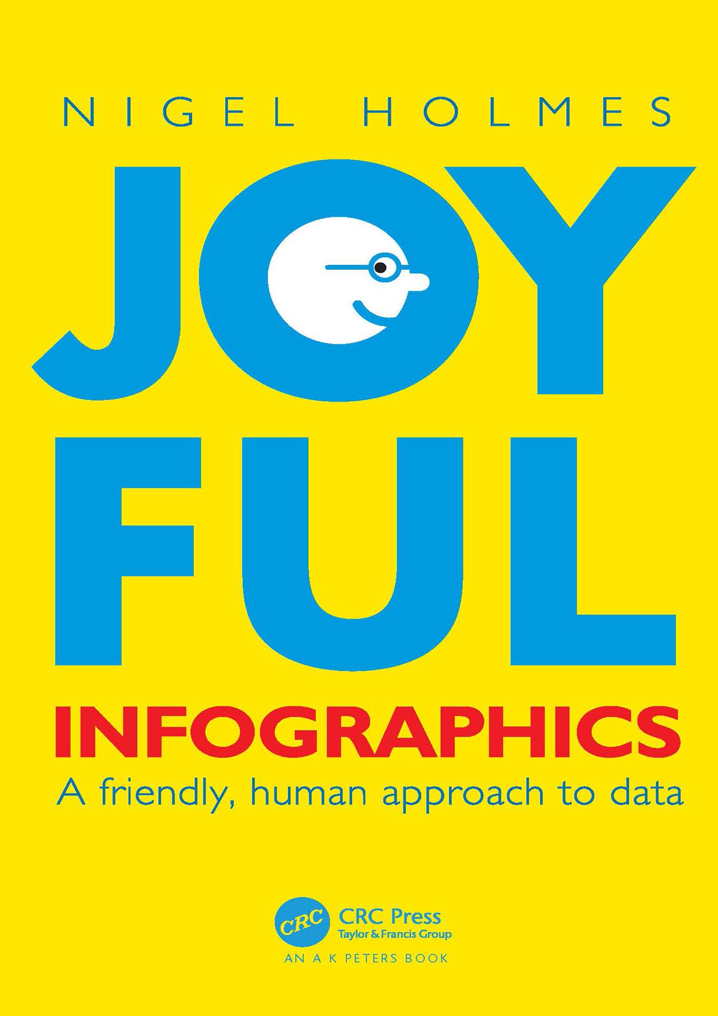
In Joyful Infographics: A Friendly, Human Approach to Data, one of the leading graphic designers of recent times shows how a judicious use of humor can make infographics more understandable. Written in non-academic, easy-to-understand language, and with historical and contemporary visual examples presented throughout, this small book provides a short history of light-hearted graphics. The text outlines nine clear ways to make graphics more understandable, explores the importance of the audience, shows you how to make information come alive during presentations through live-action ‘performance’ graphics, discusses why joy and smiling are good for you, and shows you how not to overdo it. The author website, featuring enlargeable graphics, can be found here: https://www.joyfulinfographics.com/.
Even if a subject is delicate, controversial, or taboo, being graphically friendly to the audience is the right way to explain it. It is the opposite of being clinically cold and just presenting the facts. If you can get readers to smile--the smile of recognition when they understand the graphic--you are more than halfway toward getting them to continue reading, and understanding, the intention of the piece. Joyful Infographics teaches you how to do just that.
Payez facilement par carte, Klarna, Apple Pay ou Google Pay. Pas satisfait ? Vous avez toujours une garantie de remboursement de 14 jours. En savoir plus dans nos conditions. Si vous avez des questions, envoyez-nous un e-mail à hello@memmo.org.
Memmo facilite tes études, où que tu sois dans le monde. On rassemble tes manuels de cours et des outils d'étude intelligents au même endroit : résumés, quiz, podcasts et flashcards. Et il y a Ted, ton compagnon d'étude qui répond à toutes tes questions. Plus de 50 000 étudiants étudient déjà ici – conçu pour t'aider à apprendre plus vite et à moins stresser.