
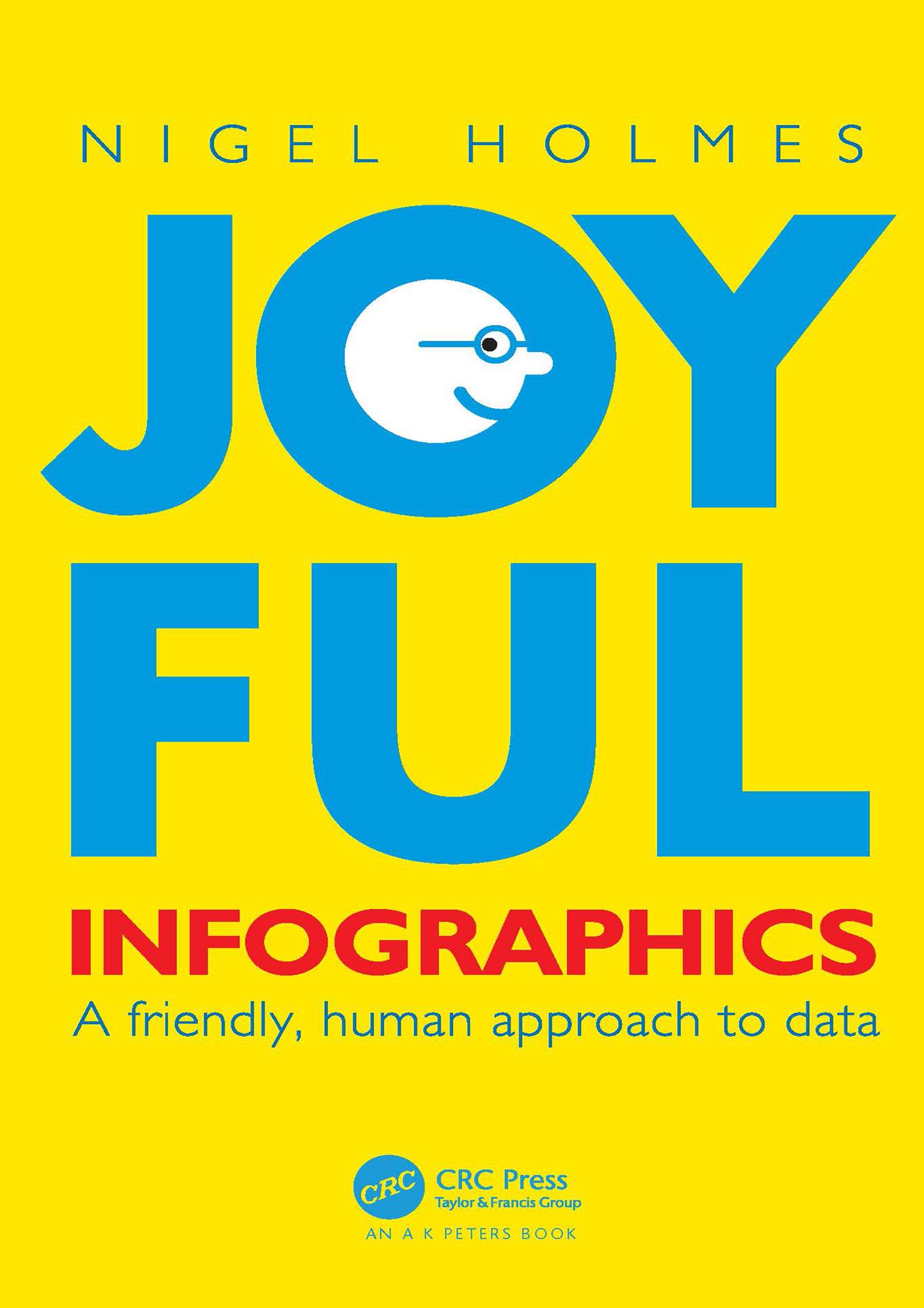
In Joyful Infographics: A Friendly, Human Approach to Data, one of the leading graphic designers of recent times shows how a judicious use of humor can make infographics more understandable. Written in non-academic, easy-to-understand language, and with historical and contemporary visual examples presented throughout, this small book provides a short history of light-hearted graphics. The text outlines nine clear ways to make graphics more understandable, explores the importance of the audience, shows you how to make information come alive during presentations through live-action ‘performance’ graphics, discusses why joy and smiling are good for you, and shows you how not to overdo it. The author website, featuring enlargeable graphics, can be found here: https://www.joyfulinfographics.com/.
Even if a subject is delicate, controversial, or taboo, being graphically friendly to the audience is the right way to explain it. It is the opposite of being clinically cold and just presenting the facts. If you can get readers to smile--the smile of recognition when they understand the graphic--you are more than halfway toward getting them to continue reading, and understanding, the intention of the piece. Joyful Infographics teaches you how to do just that.
Płać wygodnie kartą, Klarną, Apple Pay lub Google Pay. Nie jesteś zadowolony? Zawsze masz 14-dniową gwarancję zwrotu pieniędzy. Więcej przeczytasz w naszych warunkach. Masz pytania? Napisz do nas na hello@memmo.org.
Memmo ułatwia naukę – gdziekolwiek jesteś na świecie. U nas znajdziesz podręczniki i sprytne narzędzia do nauki w jednym miejscu: streszczenia, quizy, podcasty i fiszki. A do tego Ted, Twój kumpel do nauki, który odpowie na wszystko, co Cię nurtuje. Ponad 50 000 studentów już tu się uczy – stworzone, byś uczył się szybciej i mniej stresował.