
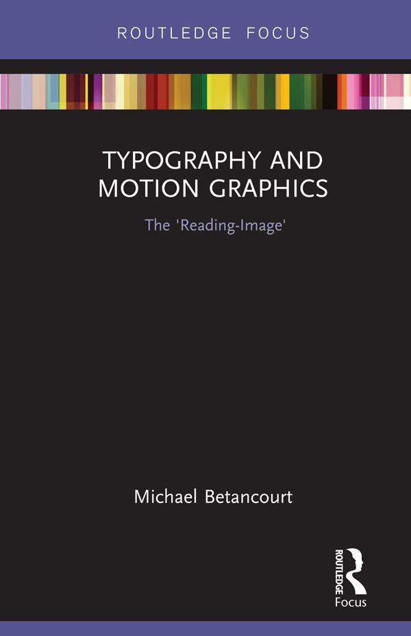
In his latest book, Michael Betancourt explores the nature and role of typography in motion graphics as a way to consider its distinction from static design, using the concept of the ‘reading-image’ to model the ways that motion typography dramatizes the process of reading and audience recognition of language on-screen. Using both classic and contemporary title sequences—including The Man With the Golden Arm (1955), Alien (1979), Flubber (1998), Six Feet Under (2001), The Number 23 (2007) and Scott Pilgrim vs. The World (2010)—Betancourt develops an argument about what distinguishes motion graphics from graphic design. Moving beyond title sequences, Betancourt also analyzes moving or kinetic typography in logo designs, commercials, film trailers, and information graphics, offering a striking theoretical model for understanding typography in media.
Płać wygodnie kartą, Klarną, Apple Pay lub Google Pay. Nie jesteś zadowolony? Zawsze masz 14-dniową gwarancję zwrotu pieniędzy. Więcej przeczytasz w naszych warunkach. Masz pytania? Napisz do nas na hello@memmo.org.
Memmo ułatwia naukę – gdziekolwiek jesteś na świecie. U nas znajdziesz podręczniki i sprytne narzędzia do nauki w jednym miejscu: streszczenia, quizy, podcasty i fiszki. A do tego Ted, Twój kumpel do nauki, który odpowie na wszystko, co Cię nurtuje. Ponad 50 000 studentów już tu się uczy – stworzone, byś uczył się szybciej i mniej stresował.