
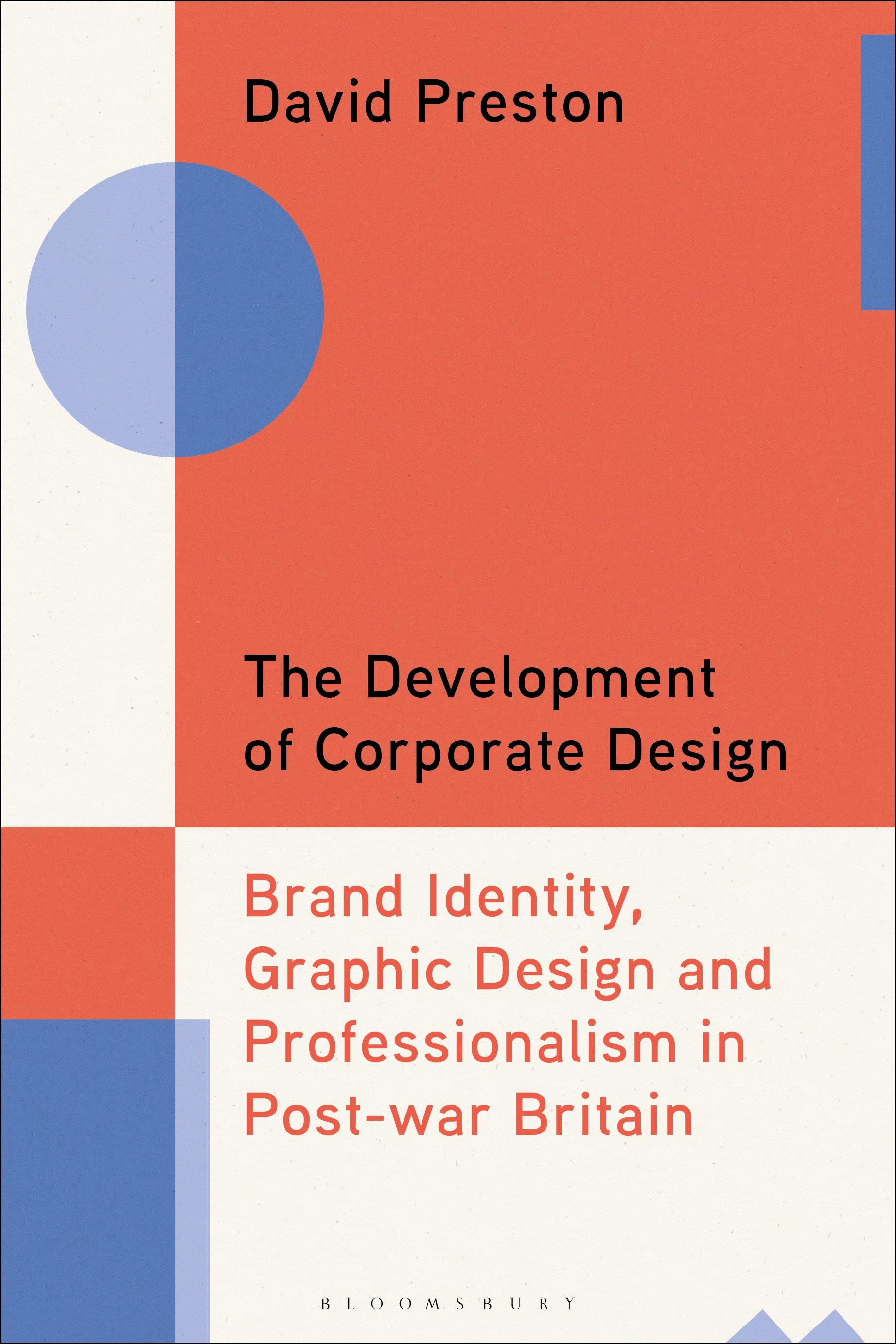
Chronicling the emergence of brand consultancy, this book explores how the development and proliferation of brand identity systems transformed the working methods and ideals of practicing graphic designers working in post-war Britain.
Practitioners in Britain were at the forefront of efforts to transform corporate identity design into a recognised practice with its own codified methods. Focussing particularly on the British experience, the book also draws on the influences and developments in this formative era in other countries, including the US and Germany. During this period designers were struggling with two conflicting paradigms - the socially motivated, free spirited artist-designer and the design entrepreneur as corporate agent.
David Preston uses three key design agencies as the springboard to explore this foundational period in the history of graphic design labour practices - the practical rationality of Hans Schleger & Associates, the systematic methods of Henrion Design Associates and the Design Research Unit and their design manual as an instrument of control. These design agencies created some of the most striking and successful brand identities of the era - the KLM logo, the British Rail double arrow, the John Lewis branding of the 1960s, Glenfiddich's iconic triangular bottle, the Post Office's house style, the National Theatre logo and many more. The case studies look at the power at play, how branding became systematic, the struggle between motives and standards, and draws on first-hand interviews with key actors and archival material.
A valuable contribution to our understanding of British post-war graphic design and the history of branding.
Practitioners in Britain were at the forefront of efforts to transform corporate identity design into a recognised practice with its own codified methods. Focussing particularly on the British experience, the book also draws on the influences and developments in this formative era in other countries, including the US and Germany. During this period designers were struggling with two conflicting paradigms - the socially motivated, free spirited artist-designer and the design entrepreneur as corporate agent.
David Preston uses three key design agencies as the springboard to explore this foundational period in the history of graphic design labour practices - the practical rationality of Hans Schleger & Associates, the systematic methods of Henrion Design Associates and the Design Research Unit and their design manual as an instrument of control. These design agencies created some of the most striking and successful brand identities of the era - the KLM logo, the British Rail double arrow, the John Lewis branding of the 1960s, Glenfiddich's iconic triangular bottle, the Post Office's house style, the National Theatre logo and many more. The case studies look at the power at play, how branding became systematic, the struggle between motives and standards, and draws on first-hand interviews with key actors and archival material.
A valuable contribution to our understanding of British post-war graphic design and the history of branding.
Pagine: 272
Categoria: Konst, Design & Fotografi
e-ISBN: 9781350384699
Peso di spedizione: 1.2 kg
Spedito in: 1-2 giorni
Paga facilmente con carta, Klarna, Apple Pay o Google Pay. Non sei soddisfatto? Hai sempre 14 giorni per il rimborso. Leggi di più nei nostri termini. Per qualsiasi domanda, scrivici a hello@memmo.org.
Memmo rende lo studio più facile, ovunque tu sia nel mondo. Qui trovi i tuoi libri di testo e strumenti di studio intelligenti, tutto in un unico posto: riassunti, quiz, podcast e flashcard. E poi c'è Ted, il tuo compagno di studio che risponde a ogni tua domanda. Oltre 50.000 studenti studiano già qui: è stato creato per aiutarti a imparare più velocemente e a stressarti meno.