
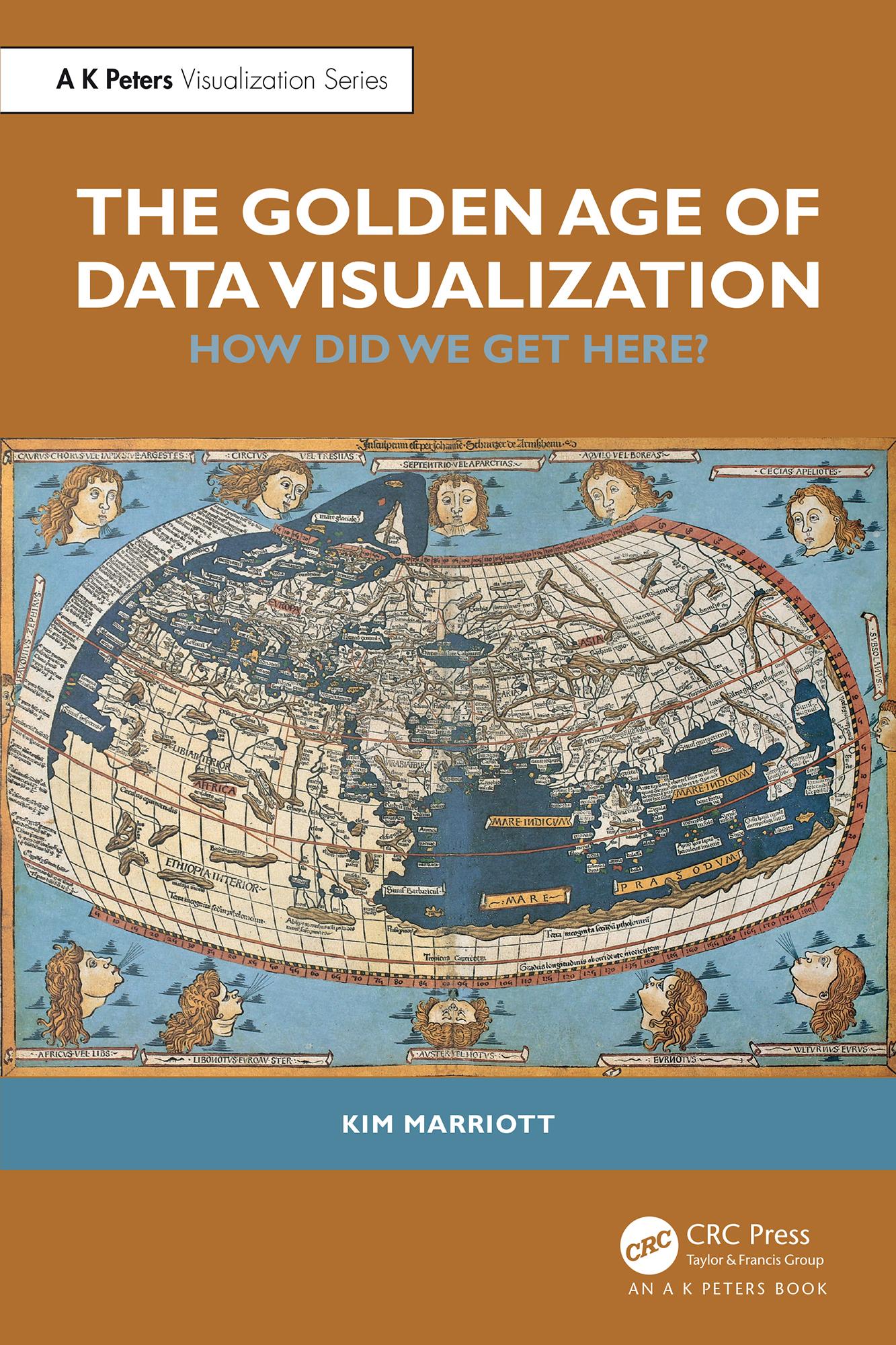
We are living in the Golden Age of Data Visualization. The COVID-19 pandemic has demonstrated how we increasingly use data visualizations to make sense of the world. Business analysts fill their presentations with charts, journalists use infographics to engage their readers, we rely on the dials and gauges on our household appliances, and we use mapping apps on our smartphones to find our way.
This book explains how and why this has happened. It details the evolution of information graphics, the kinds of graphics at the core of data visualization—maps, diagrams, charts, scientific and medical images—from prehistory to the present day. It explains how the cultural context, production and presentation technologies, and data availability have shaped the history of data visualization. It considers the perceptual and cognitive reasons why data visualization is so effective and explores the little-known world of tactile graphics—raised-line drawings used by people who are blind. The book also investigates the way visualization has shaped our modern world. The European Renaissance and the Scientific Revolution relied on maps and technical and scientific drawings, and graphics influence how we think about abstract concepts like time and social connection.
This book is written for data visualization researchers and professionals and anyone interested in data visualization and the way we use graphics to understand and think about the world.
Paga facilmente con carta, Klarna, Apple Pay o Google Pay. Non sei soddisfatto? Hai sempre 14 giorni per il rimborso. Leggi di più nei nostri termini. Per qualsiasi domanda, scrivici a hello@memmo.org.
Memmo rende lo studio più facile, ovunque tu sia nel mondo. Qui trovi i tuoi libri di testo e strumenti di studio intelligenti, tutto in un unico posto: riassunti, quiz, podcast e flashcard. E poi c'è Ted, il tuo compagno di studio che risponde a ogni tua domanda. Oltre 50.000 studenti studiano già qui: è stato creato per aiutarti a imparare più velocemente e a stressarti meno.