
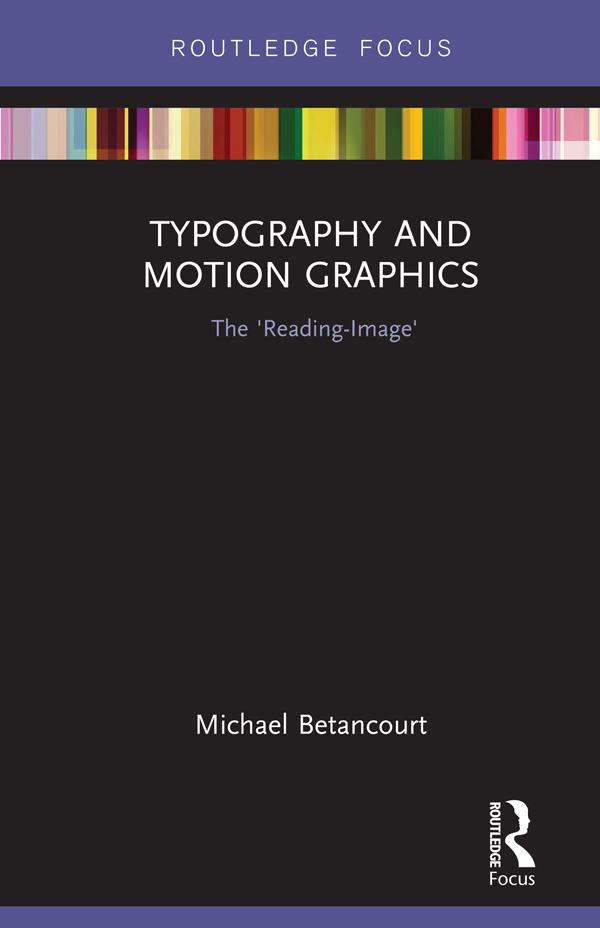
In his latest book, Michael Betancourt explores the nature and role of typography in motion graphics as a way to consider its distinction from static design, using the concept of the ‘reading-image’ to model the ways that motion typography dramatizes the process of reading and audience recognition of language on-screen. Using both classic and contemporary title sequences—including The Man With the Golden Arm (1955), Alien (1979), Flubber (1998), Six Feet Under (2001), The Number 23 (2007) and Scott Pilgrim vs. The World (2010)—Betancourt develops an argument about what distinguishes motion graphics from graphic design. Moving beyond title sequences, Betancourt also analyzes moving or kinetic typography in logo designs, commercials, film trailers, and information graphics, offering a striking theoretical model for understanding typography in media.
Paga facilmente con carta, Klarna, Apple Pay o Google Pay. Non sei soddisfatto? Hai sempre 14 giorni per il rimborso. Leggi di più nei nostri termini. Per qualsiasi domanda, scrivici a hello@memmo.org.
Memmo rende lo studio più facile, ovunque tu sia nel mondo. Qui trovi i tuoi libri di testo e strumenti di studio intelligenti, tutto in un unico posto: riassunti, quiz, podcast e flashcard. E poi c'è Ted, il tuo compagno di studio che risponde a ogni tua domanda. Oltre 50.000 studenti studiano già qui: è stato creato per aiutarti a imparare più velocemente e a stressarti meno.