
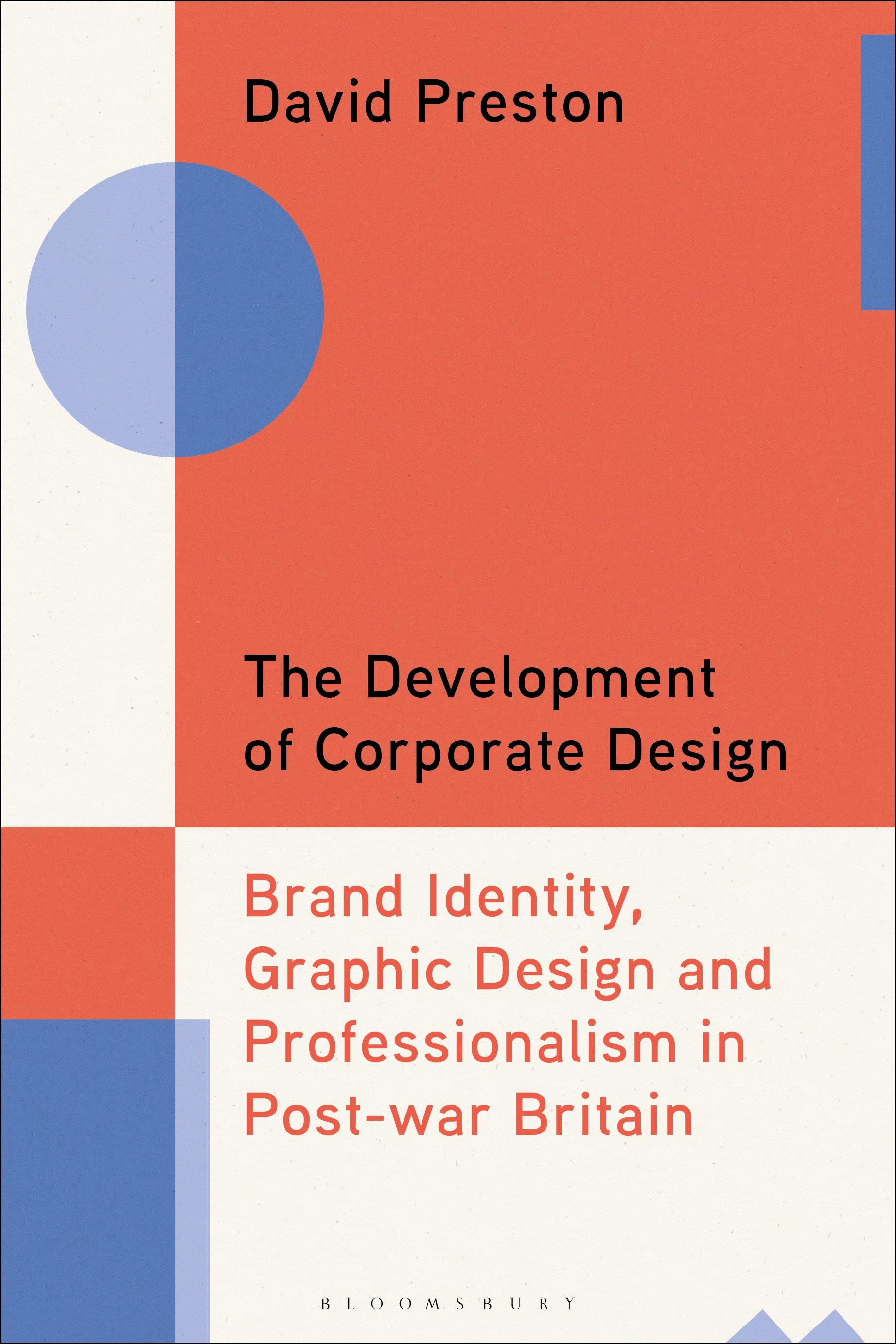
Chronicling the emergence of brand consultancy, this book explores how the development and proliferation of brand identity systems transformed the working methods and ideals of practicing graphic designers working in post-war Britain.
Practitioners in Britain were at the forefront of efforts to transform corporate identity design into a recognised practice with its own codified methods. Focussing particularly on the British experience, the book also draws on the influences and developments in this formative era in other countries, including the US and Germany. During this period designers were struggling with two conflicting paradigms - the socially motivated, free spirited artist-designer and the design entrepreneur as corporate agent.
David Preston uses three key design agencies as the springboard to explore this foundational period in the history of graphic design labour practices - the practical rationality of Hans Schleger & Associates, the systematic methods of Henrion Design Associates and the Design Research Unit and their design manual as an instrument of control. These design agencies created some of the most striking and successful brand identities of the era - the KLM logo, the British Rail double arrow, the John Lewis branding of the 1960s, Glenfiddich's iconic triangular bottle, the Post Office's house style, the National Theatre logo and many more. The case studies look at the power at play, how branding became systematic, the struggle between motives and standards, and draws on first-hand interviews with key actors and archival material.
A valuable contribution to our understanding of British post-war graphic design and the history of branding.
Practitioners in Britain were at the forefront of efforts to transform corporate identity design into a recognised practice with its own codified methods. Focussing particularly on the British experience, the book also draws on the influences and developments in this formative era in other countries, including the US and Germany. During this period designers were struggling with two conflicting paradigms - the socially motivated, free spirited artist-designer and the design entrepreneur as corporate agent.
David Preston uses three key design agencies as the springboard to explore this foundational period in the history of graphic design labour practices - the practical rationality of Hans Schleger & Associates, the systematic methods of Henrion Design Associates and the Design Research Unit and their design manual as an instrument of control. These design agencies created some of the most striking and successful brand identities of the era - the KLM logo, the British Rail double arrow, the John Lewis branding of the 1960s, Glenfiddich's iconic triangular bottle, the Post Office's house style, the National Theatre logo and many more. The case studies look at the power at play, how branding became systematic, the struggle between motives and standards, and draws on first-hand interviews with key actors and archival material.
A valuable contribution to our understanding of British post-war graphic design and the history of branding.
Betal nemt med kort, Klarna, Apple Pay eller Google Pay. Ikke tilfreds? Du har altid 14 dages fortrydelsesret. Læs mere i vores vilkår. Har du spørgsmål, så send os en mail på hello@memmo.org.
Memmo gør det nemmere at studere – uanset hvor du er i verden. Hos os samler du dine kursusbøger og smarte studieværktøjer ét sted: resuméer, quizzer, podcasts og flashcards. Og så er der Ted, din studieven, der svarer på alt, du undrer dig over. Over 50 000 studerende studerer allerede her – bygget til at hjælpe dig med at lære hurtigere og stresse mindre.